
4 min read
3 Reasons to Use Digital Badges in UX
More and more, companies are seeking creative ways to get customers engaged with their proposition, and critically, keep them coming back for more. In the world of UX, there is…

Signing up to a product or service should be easy, right? This is the first experience a user has, and it will shape their overall impression of the business. Analytics might tell you that your journey is fine – users complete it with no problems – but that doesn’t necessarily mean they’re having a great experience.
Let’s try to begin signing up for a TSB Spend & Save Account to look at three common mistakes in sign up journeys.
1. Difficult first step
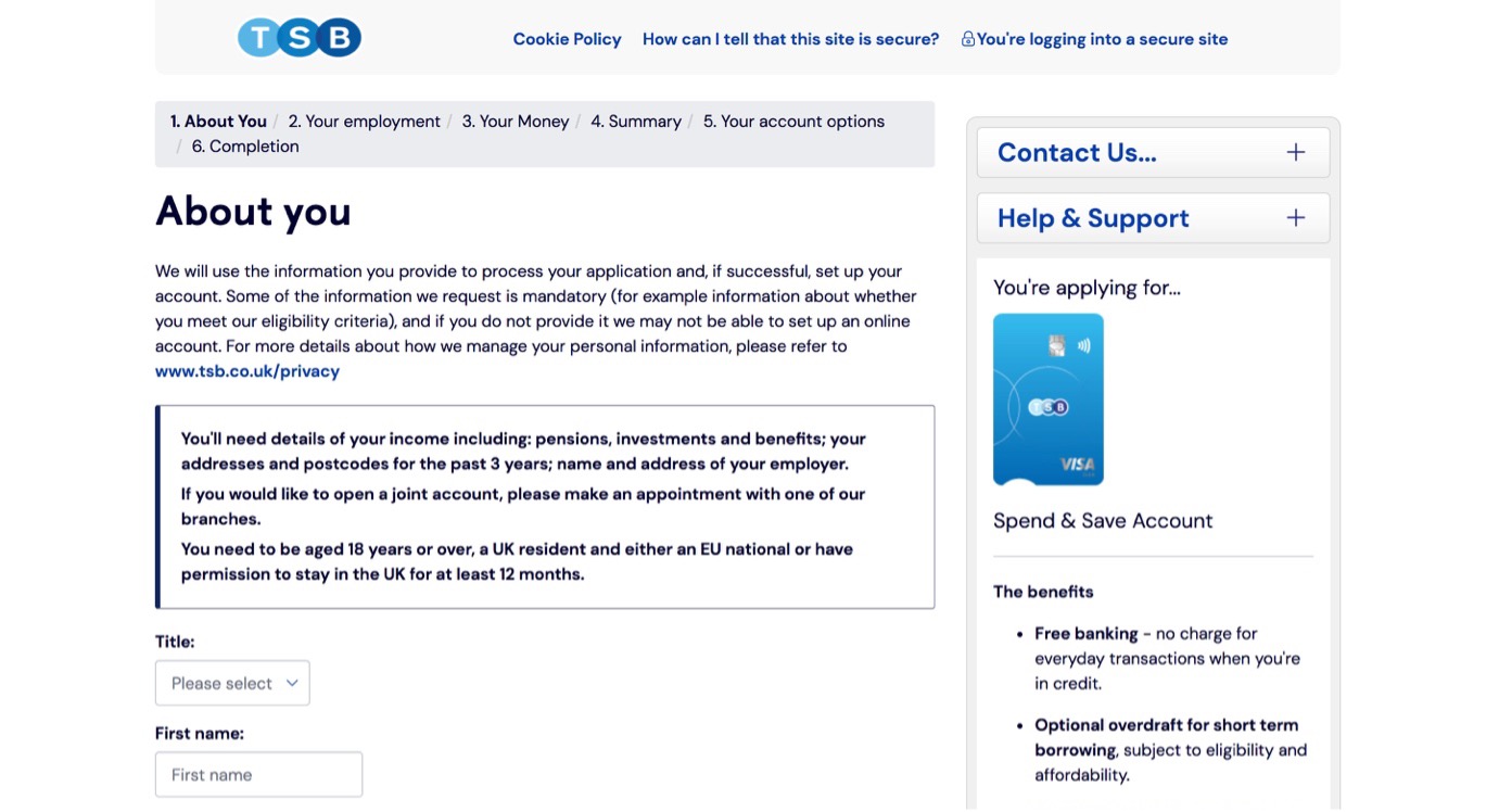
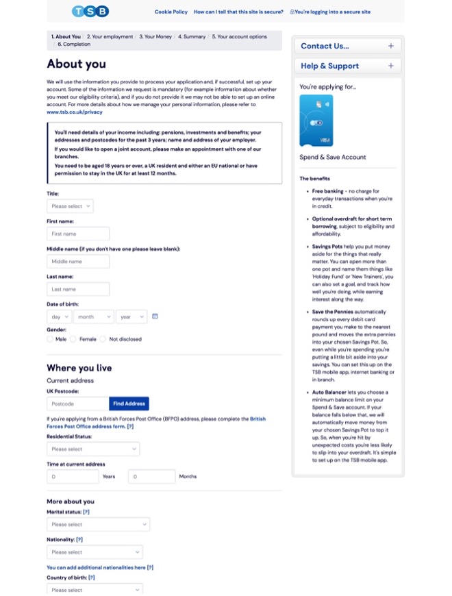
Before filling in any information, you’re asked to read 6 sentences, including a bunch of eligibility criteria. Rather than making the first step easy, it feels like there are barriers in your way before you’ve even begun. We know from Behavioural Science that the closer we are to reaching our goal, the more momentum we have towards achieving it. Known as the Goal Gradient Effect, this means that this difficult first step makes the overall experience feel harder.
Key takeaway: Make the first step as easy as possible.
2. Multiple things to do per page
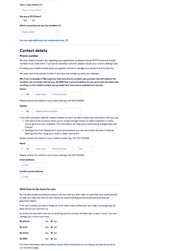
You’ll see that on this first page alone, you’re asked to give your name, contact details, and communication preferences – a total of 23 individual pieces of information. When we give users so many tasks in one go, this leads to Cognitive Overload and makes the experience feel harder. By chunking these tasks into smaller groups, or even giving users just one task per page, this makes it easier for the brain to process.
Key takeaway: Ask users to do one thing per page
3. All the text, and none of the images
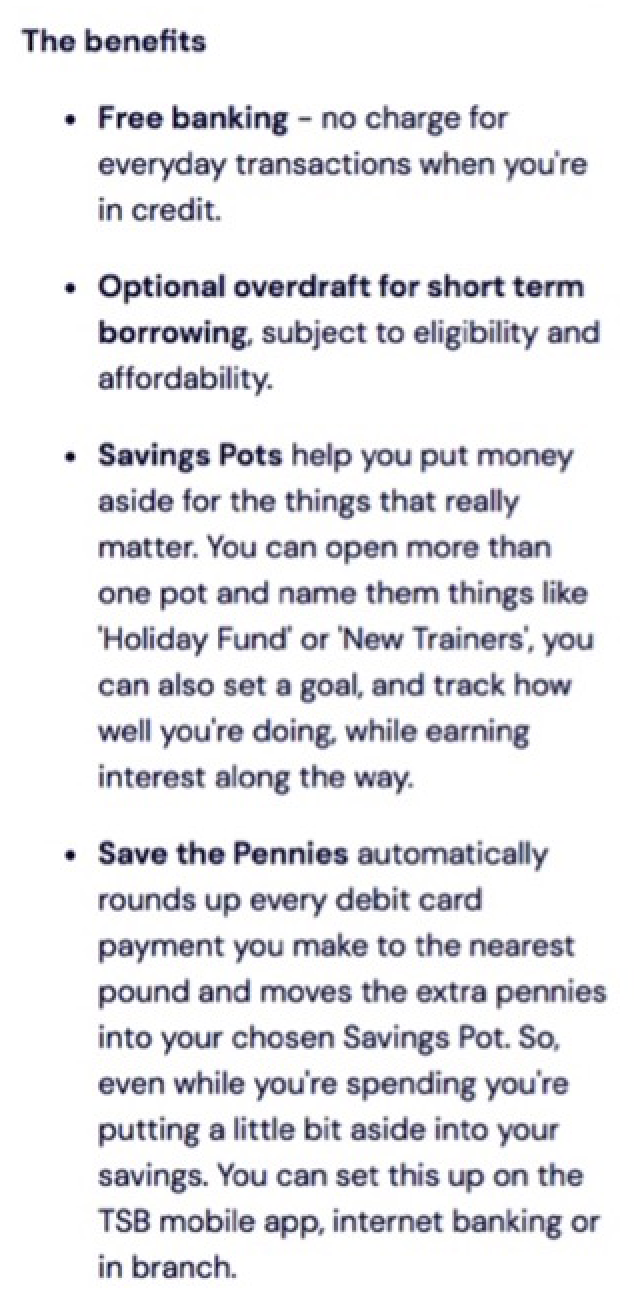 We’ve got just one image on this page – the current account card which you’re signing up for, which is helpful in case you forget what you’re doing. Currently, we’re seeing a whole lot of text and hardly any imagery, and so it’s a really cumbersome page to process because our brains find it much harder to digest text than images. For example, we’ve got some benefits pulled out on the right-hand side which are really handy to know, but there are no icons to immediately communicate that these are good things rather than just more Ts & Cs.
Key takeaway: use less text, and more icons
Here, we just looked at the first of six stages to sign up for an account. Next time you’re designing an onboarding journey, make the first step as easy as possible, only ask the user to do one thing per page, and make the most of icons. Using Behavioural Science in this way, you can create effortless and enjoyable user experiences which benefit both your customer and your business.
More and more, companies are seeking creative ways to get customers engaged with their proposition, and critically, keep them coming back for more. In the world of UX, there is…

50% of our cortex is dedicated to visual processing So although how we talk about products and services to customers is important, how we take in information is equally important. As…
Bigger, Better and Bolder. But what does ‘bolder’ really mean for the Cowry Global Summer School 2021? Earlier this year, we pledged to increase diversity and inclusion in the summer…